How to Design an Outdoor Living Space
Pro Tips and Ideas for Designing the Perfect Outdoor Living Space
Designing an Outdoor Living Space
As a Design & Build company, there are two primary components to the service we provide and both are equally important: designing and building. This may sound obvious, but the reality is a lot of people fail to appreciate the importance of landscape design. We are not just deck builders, pool builders, or gazebo installers. We are designers who specialize in outdoor living spaces. When we take on a new project, the first 4-8 weeks are all about design. Because we want those designs brought to life with the highest quality craftsmanship and attention to detail, we also build. Our building department consists of crews of master masons, custom carpenters, knowledgable landscapers, and construction managers who ensure every build is as exceptional as its design.
When you invest in a custom outdoor living space, it should be approached with the same consideration as building a custom home. You want a space that provides comfort, relaxation, and entertainment. The repercussions of a poor design are lasting. They’re felt every time you use the space and can be challenging and expensive to modify once the space is built. To break down some of the most important dos and don’ts of designing an outdoor living space, I sat down with Ventures’ lead designers, Brandon Bertrang and Jake Steward, to pick their brains on what makes the perfect outdoor living space. Let’s start with the DOS.
The Dos: Pro Tips, Ideas, and Inspiration
Q: What should be the number one consideration when designing an outdoor living space?
BB: For function, the number one consideration should always be the flow of the space. It’s no different from designing an interior space. You have to think about how people are going to move through it. For an outdoor living space to be successful it has to be functional and effortless. Things like the width and placement of a walkway can make all the difference. It’s also important to create separate areas for different purposes; cooking and dining areas, lounge areas, and play areas if children are a consideration.
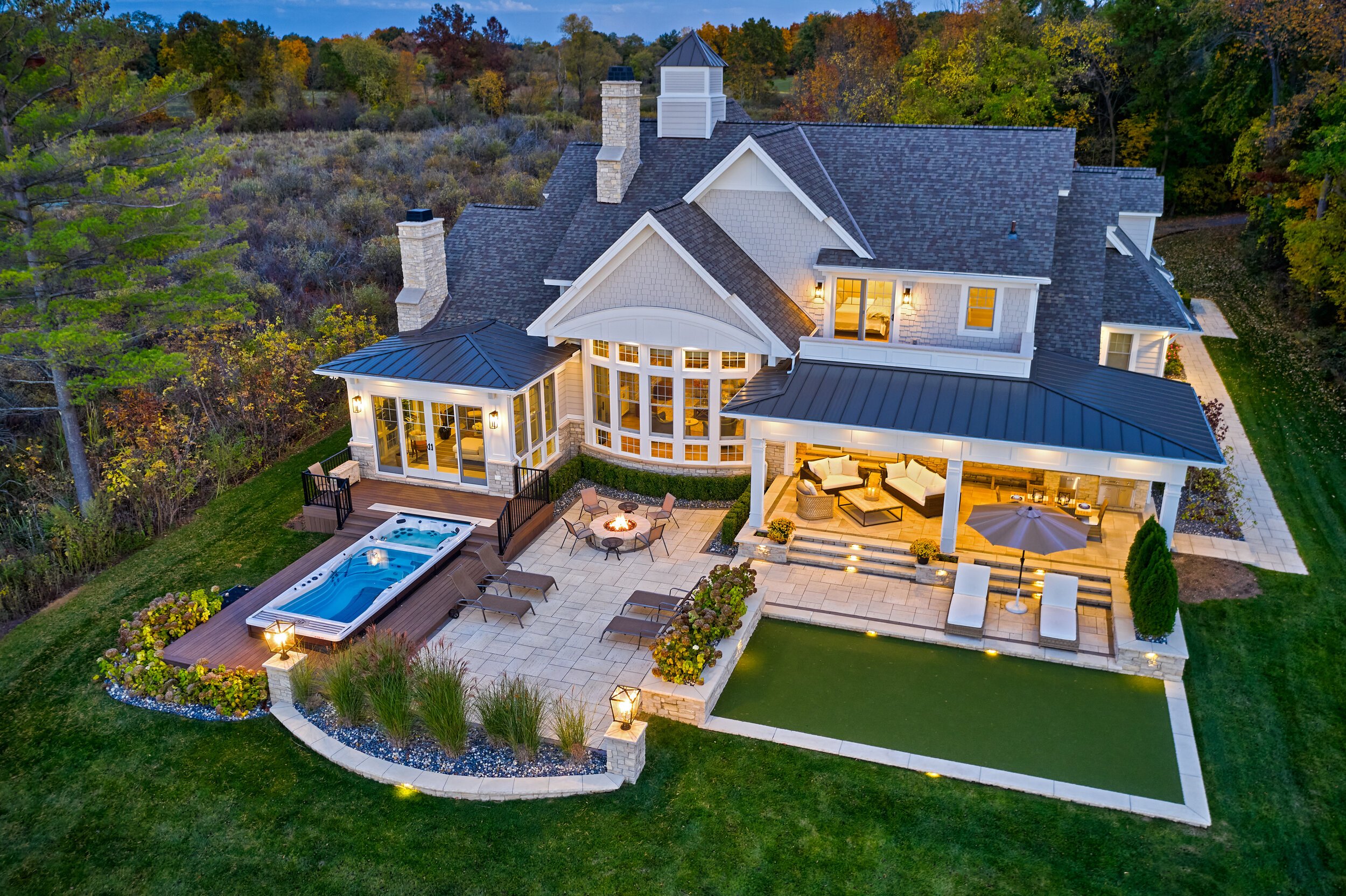
For aesthetics, it’s essential to keep the space feeling cohesive and like a natural extension of the home. This can be achieved by carrying over similar building materials from the house and matching the home’s architectural style. Ideally, once a build is complete, you wouldn’t be able to imagine the house without its outdoor living space. It should feel like a single entity, transitioning seamlessly from interior to exterior.
Our Trailwood build is a great example of how to design an outdoor space that feels like a natural extension of the home. We matched the brick from the exterior of the house and used it throughout the outdoor living space. The brick was used for wrapping the support columns on the deck, the pedestals holding fire and water bowls at the edge of the gunite pool, as well as for the built-in fire pit and custom outdoor kitchen.
Q: What are the three most important elements of an outdoor living space?
JS: Function, Form, and then how the two are combined are the 3 most important concepts to designing an outdoor space. Meaning, how well is the space used and how well do the different design elements work together with one another (function), and then how the space looks and feels (form). then combining the two in a meaningful and aesthetically appealing way.
BB: Any truly exceptional outdoor living space has to have a pool, an outdoor kitchen, and fire features for ambiance and that WOW factor.
Q: What important yet often overlooked considerations are there when designing an outdoor living space?
JS: Site-specific naturally occurring elements are often overlooked when designing an outdoor space. Each site needs to be analyzed before diving into the details of a design. Factors like sun exposures, unsightly views, slopes, and wind directions all play major roles in how a space should be designed, and having a full understanding of these site-specific details is imperative to have a well-functioning space.
BB: The orientation of the space to the sun is a big one. You want to design for a balance of shade and light so the space is never unusable or uncomfortable due to overexposure. Shade structures are another crucial element to a successful outdoor living space. It’s rare that a property will naturally provide the right balance of sunlight and shade, so adding a thoughtfully placed pergola or pavilion can make a huge difference in the usability of the space.
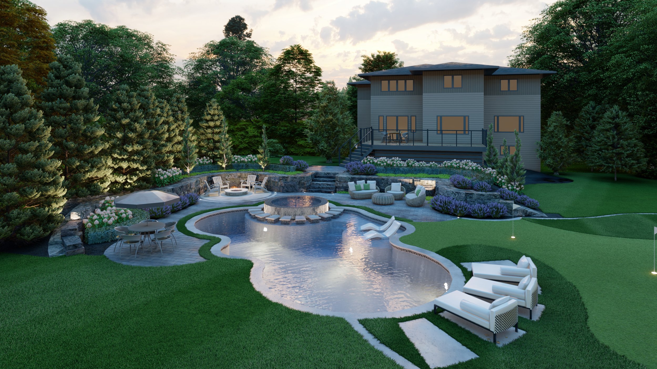
Landscaping is essential as well. People tend to think so much about the hardscape but don’t consider landscaping which is really what brings it all together. Not only does landscaping help soften the transition between the home, hardscape, and surrounding property but thoughtful landscaping can completely change the feel of an outdoor space. Using pruned, highly manicured hedges and arborvitae can create an elevated, contemporary, minimalist vibe. At the opposite end of the spectrum is a rising trend in landscaping; the urban meadow, where native plants are used to create a pollinator garden that imitates the area’s natural ecosystem. Meadow landscaping creates a much softer, ethereal environment that can bring a hint of wilderness in a very intentional way.
Outdoor lighting is often an afterthought as well. A lot of clients allocate too much of their budget to hardscape features and leave plants and lighting as an afterthought. Similarly to landscaping, the lighting of an exterior space has a huge effect on its overall appearance and usability. Lighting should be carefully considered both for ambiance and function.
Q: Many homes in urban and suburban settings are built close together. Do you have any tips on how to create privacy in an outdoor living space?
BB: Going back to landscaping, plants are the best way to create privacy. Hedges of Skyrocket Juniper or Emerald Green Arborvitae maximize privacy while using a small footprint. They create soft lines as opposed to the hard lines of a privacy structure or wall.
JS: Maintaining privacy can pose a challenge in densely populated suburban neighborhoods. I would first determine which segments of your living space require the most privacy (sitting areas, hot tubs, sunbathing areas) then strategically orient them in the space. Maybe that’s close to the house, or further away near a fence. After designing a layout that naturally maximizes privacy, plants can be used to create privacy screens. Planting close to a sitting area can provide a lot more privacy with fewer plants compared to perimeter plantings further out in the yard.
When landscaping for privacy, it is crucial to consider the type of plant. If you plant a deciduous tree near your seating area consider the canopy of the tree will be up higher and privacy might not be achieved as views can be seen under the tree, whereas an evergreen will provide the most privacy lower to the ground as it gets more narrow towards the top. If it’s a hot tub you are trying to screen consider if you will be using it in the winter because deciduous trees will lose their leaves and eliminate a lot of privacy during that time of year.
Our Basswood Court project features a hedge of Emerald Green Arborvitae surrounding the entire perimeter. Planted at 8’ tall, the Arborvitae will mature to a height of 15’ while keeping their narrow, conical form to create a lot of privacy from a very small footprint.
The Don’ts: Mistakes to avoid when designing an outdoor living space
Q: What are the most common mistakes you see in the design of outdoor living spaces?
BB: Bad material selections. It can be appealing to choose certain materials because they jump out at you but using things that clash with the home never turns out well.
Poor spatial planning as well. I see a lot of designs that cram too much into a space. You have to think about function and usability. It really won’t matter how many cool features you pack into a space if it’s too cramped to enjoy.
JS: Overcomplicating spaces. Often times simplicity is better and I'm learning that as I design more and more. Some of my favorite and most memorable spaces utilize the beauty of nature and are very simple. Avoid overcomplicating a space and over-designing. Try to embrace naturally occurring elements and sometimes the simplest solution is the best.
Any pet peeves? Something you see in other companies' designs that drive you crazy?
BB: Proportions! Using very small plants that just look out of proportion with the space. Like tiny boxwood and arborvitae. Walkways that are too narrow for two people to comfortably walk down side by side. Things like that really jump out and make a design look off-balance and unprofessional.
JS: Not planting in grouped masses. I often see plant beds that have a ton of different plants of all different types in one bed, which results in a busy overcomplicated space. It’s much easier on the eye and helps a space come together as a coherent whole if plants are repeated and grouped together throughout the landscape to create masses and layers. it’s easier to look at a large group of the same flower in a plant bed than at a lot of different types, sizes, and shapes, of plants peppered together.
When I look at beautiful planting designs, they often have no more than 5 varieties of plants, brought together in a meaningful way.


